We've almost seen all there is to see of the button widget. It's pretty simple.
There is however more than one way to create a button. You can use the
buttonNewWithLabel or buttonNewWithMnemonic to create
a button with a label, use buttonNewFromStock to create a button
containing the image and text from a stock item or use buttonNew
to create a blank button. It's then up to you to pack a label or pixmap into
this new button. To do this, create a new box, and then pack your objects into
this box using the usual boxPackStart (or boxPackEnd
to pack from the end), and then use containerAdd to pack the box
into the button.
buttonNewWithMnemonic and buttonNewFromStock both
take a string as first argument. Use an underline to mark a character as a
mnemonic, which is a keyboard accelerator. Pressing Alt and
that key activates the button. In the second function the string is a
stockId, an identifier to a list of predefined images with labels.
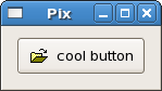
Here's an example of using buttonNew to create a button with an
image and a label in it.
import Graphics.UI.Gtk

main :: IO ()
main = do
  initGUI
  window <- windowNew
  set window [windowTitle := "Pix",
              containerBorderWidth := 10]
  button <- buttonNew
  onClicked button (putStrLn "button clicked")
  box    <- labelBox "info.xpm" "cool button"
  containerAdd button box
  containerAdd window button
  widgetShowAll window
  onDestroy window mainQuit
  mainGUI

labelBox :: FilePath -> String -> IO HBox
labelBox fn txt = do
  box   <- hBoxNew False 0
  set box [containerBorderWidth := 2]
  image <- imageNewFromFile fn
  label <- labelNew (Just txt)
  boxPackStart box image PackNatural 3
  boxPackStart box label PackNatural 3
  return box
The labelBox function could be used to pack images and labels into
any widget that can be a container. The image comes from a file using
imageNewFromFile and the label comes from labelNew,
which takes a Maybe String as its argument. Nothing
means no label.
The Button widget has the following basic signals, which are
almost self-explanatory:
onPressed - emitted when pointer button is pressed within
Button widget
onReleased - emitted when pointer button is released within
Button widget
onClicked - emitted when pointer button is pressed and then
released within Button widget
onEnter - emitted when pointer enters Button widget
onLeave - emitted when pointer leaves Button widget
Toggle buttons are derived from normal buttons and are very similar, except they will always be in one of two states, alternated by a click. They may be depressed, and when you click again, they will pop back up. Click again, and they will pop back down.
Toggle buttons are the basis for check buttons and radio buttons, as such, many of the calls used for toggle buttons are inherited by radio and check buttons. I will point these out when we come to them.
Creating a new toggle button:
toggleButtonNew :: IO ToggleButton

toggleButtonNewWithLabel :: String -> IO Togglebutton

toggleButtonNewWithMnemonic :: String -> IO ToggleButton
As you can imagine, these work identically to the normal button widget calls. The first creates a blank toggle button, and the last two, a button with a label widget already packed into it. The mnemonic variant additionally parses the label for "_"-prefixed mnemonic characters.
To retrieve the state of the toggle widget, including radio and check buttons, we use:
toggleButtonGetActive :: ToggleButtonClass self => self -> IO Bool
This returns True if the toggle button is pressed in and False if it is raised.
To force the state of a toggle button, and its children, the radio and check buttons, use this function:
toggleButtonSetActive :: ToggleButtonClass self => self -> Bool -> IO ()
The above call can be used to set the state of the toggle button, and its children the radio and check buttons. Passing in your created button as the first argument, and True or False for the second state argument to specify whether it should be down (depressed) or up (released). Default is up, or False.
Note that when you use the toggleButtonSetActive function, and the
state is actually changed, it causes the onClicked and
onToggled signals to be emitted from the button.
Check buttons inherit many properties and functions from the the toggle buttons above, but look a little different. Rather than being buttons with text inside them, they are small squares with the text to the right of them. These are often used for toggling options on and off in applications.
The creation functions are similar to those of the normal button.
checkButtonNew :: IO CheckButton

checkButtonNewWithLabel :: String -> IO Checkbutton

checkButtonNewWithMnemonic :: String -> IO CheckButton
The checkButtonNewWithLabel function creates a check button with a
label beside it.
CheckButton is an instance of ToggleButtonClass and
the onToggled signal is used when a CheckButton is
checked or unchecked, just as with the toggle button.
Radio buttons are similar to check buttons except they are grouped so that only one may be selected/depressed at a time. This is good for places in your application where you need to select from a short list of options. Creating a new radio button is done with one of these calls:
radioButtonNew :: IO RadioButton

radioButtonNewWithLabel :: String -> IO RadioButton

radioButtonNewWithMnemonic :: String -> IO RadioButton

radioButtonNewFromWidget :: RadioButton -> IO RadioButton

radioButtonNewWithLabelFromWidget :: RadioButton -> String -> IO RadioButton

radioButtonNewWithMnemonicFromWidget :: RadioButton -> String -> IO RadioButton
You'll notice the extra argument to the last three functions. They are used to link the new buttons to the ones constructed earlier in a group.
It is also a good idea to explicitly set which button should be the default depressed button with:
toggleButtonSetActive :: ToggleButtonClass self => self -> Bool -> IO ()
This is described in the section on toggle buttons, and works in exactly the
same way. Once the radio buttons are grouped together, only one of the group
may be active at a time. If the user clicks on one radio button, and then on
another, the first radio button will first emit a onToggled signal
(to report becoming inactive), and then the second will emit its
onToggled signal (to report becoming active).
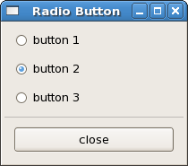
The following example creates a radio button group with three buttons, and when
the user presses one of the radio buttons, the toggled ones will report this to
stdout, using putStrLn in the
setRadioState function defined below.
import Graphics.UI.Gtk

main :: IO ()
main = do
  initGUI
  window  <- windowNew
  set window [windowTitle := "Radio Button", containerBorderWidth := 5,
              windowDefaultWidth := 200, windowDefaultHeight := 150]
  box1    <- vBoxNew False 0
  containerAdd window box1
  box2    <- vBoxNew False 10
  containerSetBorderWidth box2 10
  boxPackStart box1 box2 PackNatural 0
  button1 <- radioButtonNewWithLabel "button 1"
  boxPackStart box2 button1 PackNatural 0
  button2 <- radioButtonNewWithLabelFromWidget button1 "button 2"
  boxPackStart box2 button2 PackNatural 0
  button3 <- radioButtonNewWithLabelFromWidget button2 "button 3"
  boxPackStart box2 button3 PackNatural 0
  toggleButtonSetActive button2 True
  onToggled button1 (setRadioState button1)
  onToggled button2 (setRadioState button2)
  onToggled button3 (setRadioState button3)
  sep     <- hSeparatorNew
  boxPackStart box1 sep PackNatural 0
  box3    <- vBoxNew False 10
  containerSetBorderWidth box3 10
  boxPackStart box1 box3 PackNatural 0
  closeb  <- buttonNewWithLabel "close"
  boxPackStart box3 closeb PackNatural 0
  onClicked closeb mainQuit
  widgetShowAll window
  onDestroy window mainQuit
  mainGUI

setRadioState :: RadioButton -> IO ()
setRadioState b = do
  state <- toggleButtonGetActive b
  label <- get b buttonLabel
  putStrLn ("State " ++ label ++ " now is " ++ (show state))